pacman::p_load(tidyverse, haven, ggiraph, ggthemes, ggdist, plotly, DT, ggplot2, crosstalk)Take Home Exercise 3: Be Weatherwise or Otherwise
Project Brief
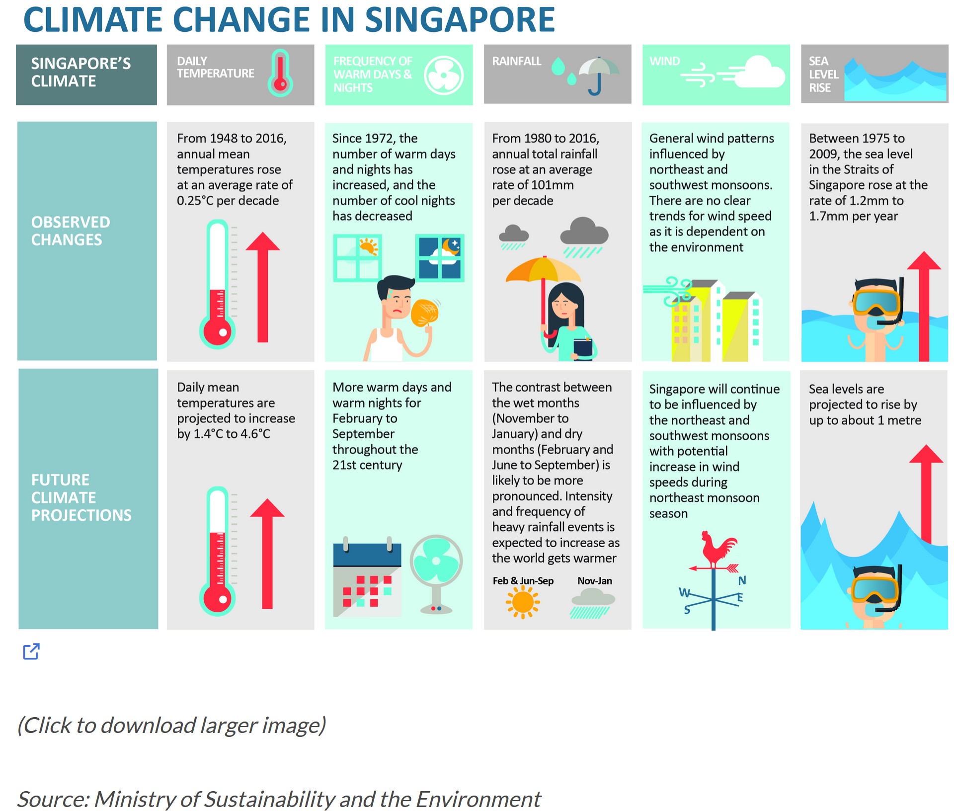
In this project, the focus is on validating temperature projections outlined in an office report, as indicated in the infographic, by leveraging newly acquired methods involving visual interactivity and visualising uncertainty methods to validate the claims made in the report.
Project Objectives
This project aims to employ interactive techniques and functions to unveil insights from historical daily temperature data sourced from the Meteorological Service Singapore website. Focusing on daily temperatures in Changi for April across the years 1983, 1993, 2003, 2013 and 2023, the goal is to create analytics-driven visualizations. The primary objective of this project is to enhance user experience through interactive features, facilitating dynamic data exploration and visual storytelling.
Data Preparation
Loading R packages
The Data
This project will concentrate on extracting historical daily temperature or rainfall data from the Meteorological Service Singapore website. Despite the numerous data covering various areas in Singapore and multiple months, the focus will be on the month of April for the years 1983, 1993, 2003, 2013, and 2023 in Changi area specifically.
Importing the Data
The code chunks below uses read_sas() of haven to import data from different years into R environment.
data_2023 <- read_csv("data/2023.csv")data_2013 <- read_csv("data/2013.csv")data_2003 <- read_csv("data/2003.csv")data_1993 <- read_csv("data/1993.csv")data_1983 <- read_csv("data/1983.csv")Data Wrangling
The below code chunk will combine the data of 5 years into one table.
temperature <- rbind(data_2023,data_2013,data_2003,data_1993,data_1983)This code below converts the “Year” and “Day” column in the “temperature” dataset to a factor. This is done when the column contains discrete and unordered categories, to treat them as factors rather than numerical values, which is useful for categorical data.
temperature$Year = as.factor(temperature$Year)
temperature$Day = as.factor(temperature$Day)
The provided code calculates the average mean temperature each year, grouping the data by years. The results are stored in a new data frame called “avg_temperature”, which will be used for the cycle plot later.
avg_temperature <- temperature %>%
  group_by(Year) %>%
  summarise(avgvalue = mean(`Mean Temperature (°C)`))
The below code computes the count, mean, and standard deviation of the ‘Mean Temperature (°C)’ variable within each year. Additionally, the standard error is calculated and added as a new variable. This summarization yields key statistical measures which will be used later to visualize uncertainty.
temp_stat <- temperature %>%
  group_by(Year) %>%
  summarise(
    n=n(),
    mean=mean(`Mean Temperature (°C)`),
    sd=sd(`Mean Temperature (°C)`)
    ) %>%
  mutate(se=sd/sqrt(n-1))
Data Visualization
Calendar Heatmap
Show code
ggplotly(ggplot(temperature,
       aes(Day,
           Year,
           fill = `Mean Temperature (°C)`)) +
geom_tile(color = "black",
          size = 0.1) +
theme_tufte(base_family = "Helvetica") +
scale_fill_gradient(name = "°C",
                    low = "light yellow",
                    high = "#003200") +
labs(x = NULL,
     y = NULL,
     title = "Temperatures in Month of April") +
theme(axis.ticks = element_blank(),
      plot.title = element_text(hjust = 0.5),
      legend.title = element_text(size = 8),
      legend.text = element_text(size = 6)))
This graph visually represents temperature variations in the month of April across different years. Each square on the plot corresponds to a specific day and year, with the color inside representing the mean temperature in degrees (°C). The color scale ranges from light yellow to dark green, indicating lower to higher temperatures. The graph follows a tile plot style, showcasing patterns and trends in temperature changes over time. The y-axis is specifically scaled for the years 1983, 1993, 2003, 2013, and 2023. The visualization allows us to easily understand temperature fluctuations throughout April, providing insights into how temperatures have evolved over the specified years.
Interactivity Features
Hover Information: When the cursor hovers over a specific tile in the heatmap, a tooltip displays additional information about that data point, including the Day, Year, and the corresponding Mean Temperature (°C).
Zooming: You can zoom in and out of the plot to explore specific regions or time periods.
Panning: You can pan across the plot to navigate through different sections.
Legend Interaction: The legend allows interactive selection for the temperature range (°C) by clicking on the legend items, which can be used to explore specific temperature intervals.
Takeaways
In the dataset, the year 1983 stands out as having the highest temperatures for the majority of days in the month of April when compared to the other four years.
On the other hand, 1993 appears to experience the coolest temperatures consistently throughout April, with the year 2003 following closely in terms of lower temperatures.
While no obvious trend emerges from the heatmap, it is noteworthy that temperatures started on a higher note, then experiencing a subsequent drop, and then exhibiting a gradual fluctuation, with a general rise leading up to the most recent year in the dataset.
Cycle Plot
Show code
ggplotly(ggplot() +
  geom_line(data=temperature,
            aes(x=Day,
                y=`Mean Temperature (°C)`,
                group=Year),
            colour="black") +
  geom_hline(aes(yintercept = avgvalue),
             data=avg_temperature,
             linetype=6,
             colour="#2ec20a",
             size=0.7) +
  facet_grid(~Year) +
  labs(axis.text.x = element_blank(),
       title = "") +
  xlab("") +
  ylab("°C") +
  theme_tufte(base_family = "Helvetica"))
The plot showcases the daily mean temperatures in the month of April across multiple years, with each year represented by a distinct line. Additionally, the horizontal green lines indicate the average temperature for each year. The plot is divided into facets, with each facet corresponding to a specific year, facilitating a clear comparison of temperature trends.
Interactivity Features
Tooltip: Hovering over data points reveals detailed information, such as the specific temperature value at that point.
Legend Interaction: Clicking on the legend entries toggles the visibility of the corresponding year’s line, enabling users to focus on specific years and declutter the plot.
Zooming and Panning: You can zoom in on specific regions of the plot or pan across the entire visualization to closely examine temperature variations across days and years.
Takeaways
- Other than the change from year 1983 to 1993, which shows a huge drop in temperature. The temperature changes for the corresponding years increased at an average rate of 0.32°C per decade as shown in the table below:
| Years | Temperature Change |
| 1993 - 2003 | 0.29 |
| 2003 - 2013 | 0.33 |
| 2013 - 2023 | 0.33 |
- This validates the claim made in the report shown at the beginning of this exercise, where “annual mean temperatures rose at an average rate of 0.25°C per decade”.
Animated Bubble Plot
Show code
gg <- ggplot(temperature,
       aes(x = Day,
           y = `Mean Temperature (°C)`,
           size = `Mean Temperature (°C)`,
           color = Year)) +
  geom_point(aes(size = `Mean Temperature (°C)`, frame = Day),
             alpha = 0.7) +
  scale_colour_manual(values = c("1983" = "#DC7633",
                                  "1993" = "#A569BD",
                                  "2003" = "#58D68D",
                                  "2013" = "#F4D03F",
                                  "2023" = "#5DADE2")) +
  scale_size(range = c(2, 12)) +
  labs(x = 'Days in April',
       y = 'Temperature') +
  theme(legend.position='bottom') +
  guides(color = guide_legend(title = "Year",
                             override.aes = list(size = 3),
                             ncol = 1))

ggplotly(gg)
The graph above employs points that vary in both size and color, with the y axis representing mean temperature, and the x axis representing the days in April. As the animation progresses through each day of the month, viewers can discern patterns and trends in temperature changes. Each year is represented by a different color, while the dynamic size of the points describes the value of the temperture.
Uncertainty
Show code
temp_df = temp_stat[, c("Year", "mean", "sd", "se")]

bscols(
  widths = c(6, 6),
  ggplotly(
    ggplot(temp_df) +
      geom_errorbar(
        aes(
          x = Year,
          ymin = mean - 2.58 * se,
          ymax = mean + 2.58 * se
        ),
        width = 0.2,
        colour = "black",
        alpha = 0.9,
        size = 0.5
      ) +
      geom_point(
        aes(
          x = Year,
          y = mean,
          text = paste(
            "Year:", Year,
            "<br>Temp:", round(mean, digits = 2),
            "<br>99% CI:[",
            round((mean - 2.58 * se), digits = 2), ",",
            round((mean + 2.58 * se), digits = 2), "]"
          )
        ),
        stat = "identity",
        color = "#2ec20a",
        size = 1.5,
        alpha = 1
      ) +
      xlab("Year") +
      ylab("Temp (°C)") +
      theme_minimal() +
      theme(
        axis.text.x = element_text(angle = 45, vjust = 0.5, hjust = 1)
      ) +
      ggtitle("99% CI of Avg Temp in April"),
    tooltip = "text"
  ),
  DT::datatable(
    temp_df,
    rownames = FALSE,
    class = "compact",
    width = "100%",
    options = list(pageLength = 10, scrollX = TRUE),
    colnames = c("Year", "Avg Temp", "Std Dev", "Std Error")
  ) %>%
    formatRound(columns = c('mean', 'sd', 'se'), digits = 2)
)
This R code combines both graphical and tabular representations of temperature data for the month of April across different years, which are arranged side by side. On the left, there is a graph that shows a plot of interactive error bars for the 99% confidence interval of mean temperature in the months of April for the five years. On the other hand, the right side shows a compact table that complements the visual representation, providing a numerical summary of information including the standard deviation and standard error. Upon mouse hover, on the point of the graph, each year’s mean temperature and its 99% confidence interval range.
| Year | 99% Confidence Interval |
|---|---|
| 1983 | [28.95, 29.81] |
| 1993 | [27.17, 28.01] |
| 2003 | [27.55, 28.22] |
| 2013 | [27.76, 28.66] |
| 2023 | [28.17, 28.92] |
Conclusion
In this exercise, the April temperature data from 1983, 1993, 2003, 2013 and 2023 were visualized and compared, to show trends. Other than the temperature change from year 1983 to 1993, a pattern can be seen, with results showing a constant increase of temperature every decade, which validates the claim in the infographic by Ministry of Sustainability and the Environment.